A building is comprised of a series of elements, such as doors, windows, and roofs. Some elements can be structural, like the exterior walls and roof, and some elements can be non-structural, like ornaments. The elements in a building meet at a junction called a joint. Articulation refers to the arrangement of these joints in the overall architectural design. A highly articulated building emphasizes each element and so each element is independent and distinct. The opposite is a fluid articulation. Here is the emphasis is on continuity and fusion. Both styles of articulation can be visually distinctive. I like when cities feature examples of multiple styles of articulation.
Here are some examples of some visually distinctive buildings.
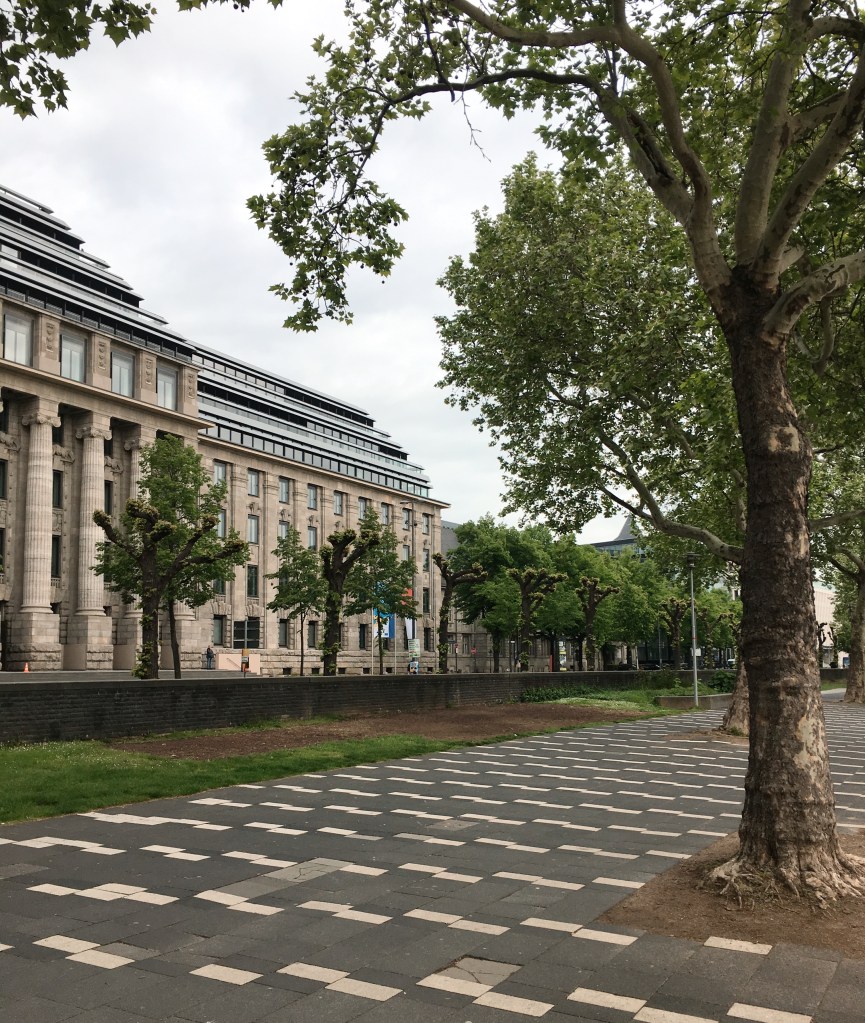
I love when the surrounding area is also visually distinctive. In this photo, the trees and the walking path accentuate the building and vice versa. The columns and tall windows on the front of the building emphasize the verticality of the façade. It is as if the façade is soaring into the sky on an infinite upward trajectory. It reaches dizzying heights that brings out the sheer monumentality of the building. Once the soaring effect has been achieved for the viewer, the façade terminates at a horizontal band of square windows that span the length of the building. The verticality of the wall is a feature of Romanesque architecture, which is fitting because Cologne is famous for its twelve Romanesque churches. The ribbon windows at the top of the building are also a callback to the International Style of architecture that had its origins in the Bauhaus in Germany. The combination of classic and modern elements makes this building very unique.
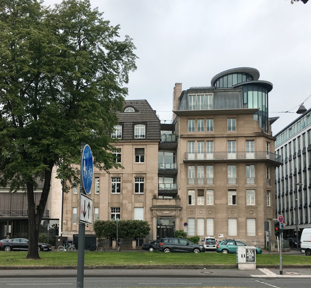
These two buildings remind me of siblings. They have shared elements that came from a singular source, or idea, but each building approaches the overall design in a slightly different way. The building on the left has the mansard roof that dominates the upper third of the façade. The windows are large but are broken up into thirds, matching the exterior wall. The same windows are in the mansard but they are given a subtly rounded “eyebrow” top. The topmost windows are semicircular and are given the full “eyebrow” top. This helps break up the rectangularness of the overall design. The building on the right has upper balconies that span the length of the building and break the building up into thirds. The roof is very unique in that it has two futuristic looking rounded windows with an inclined flat top that reminds me of the U.S.S. Enterprise from Star Trek. Since the building sits on the corner, the two rounded windows help soften the edge. Where in most buildings there would be a 90 degree angle where the two walls meet, here the walls meet and there is no corner. What better way to further soften the angle then by putting a rounded window at the top that dominates the overall design of the building. I think the ultimate tour de force of the building is the middle section of windows and balconies that occupy in the negative space between the two.
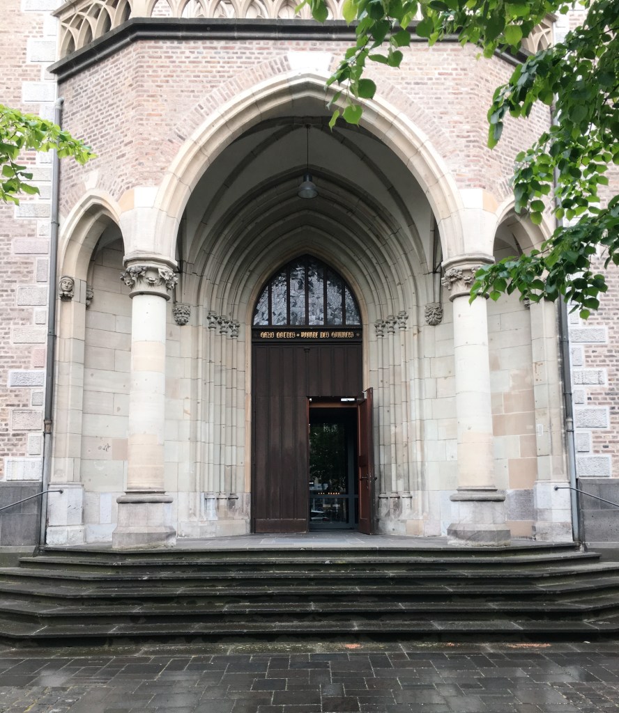
Here we have a simple entrance that is dominated by two unfluted columns reminiscent of the Tuscan order and topped with capitals that look like they are inspired by the Corinthian order. As we walk through the columns and inside the church porch, we see that this simple entrance is a little deceiving. There are numerous elements from church architecture. The walls at the back of the porch are lined with columns that are typically seen inside Gothic churches. These types of columns emphasize the verticality of the interior of Gothic churches and soar up the wall and into the ceiling vault. Here they serve a similar purpose but they are presented on a smaller scale and are located outside. The long thin vertical shafts meet the arches from above at an elaborately carved pier. The design of the pier calls back to the capitals that adorn the unfluted columns at the porch entrance. The vertical shafts protrude from the exterior wall just enough to give the wall some character. The arches accentuate the design of the vault above and also give it character. The combination of brick and stone walls brings the design altogether. And to top off the façade, there is a large wood door capped by stained glass. The door is given extra emphasis as it is the termination point of the columns. Walking into this building is a truly delightful visual experience.
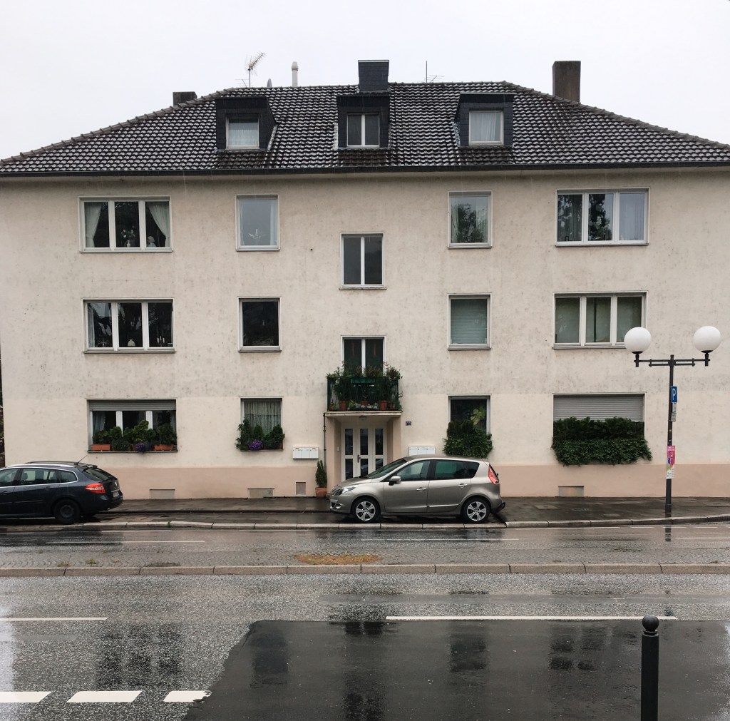
I like the symmetry of this building. Whereas a highly articulated façade emphasizes each element, here each element takes on a supporting role and contributes to the design as a whole. The exterior wall is continuous. Each window is simple and effective. The mansard roof is elongated and has three dormer windows. Whereas the mansard roof in picture #2 contributed to the buildings overall rectangularness, here it is as if the rectangular was pushed on its side. The horizontal effect is just as powerful. The elongated roof combines with the other elements to create a visual distinctive façade. Rather than taking in each element separately and working our way up to the overall design like we did in the previous pictures, here we take in the building as a whole from the beginning and then work backwards to see how each element contributes to the overall design. The modern looking streetlamp contributes positively to the design as well.
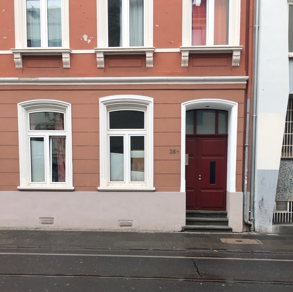
This façade is similar to the one in picture #4 but here color plays an important role. The lower level windows and door have the rounded “eyebrow” tops that we saw above. This helps break up the squareness of the façade. While the façade in picture #4 is elongated, here the exterior wall seems compressed. The windows are larger, but the gaps of wall between windows are shorter. But despite this the symmetry is preserved. We can see that in the comparison between the upper floor and lower floor. The upper windows have sills that extend out perpendicular to the wall and are “supported” by corbels underneath. The windows on the lower floor don’t have corbels but there is a large band of concrete rising up from the ground that is reminiscent of the architecture of Palladio. The upper and lower floor are separated by a thin concrete sill band and there is an additional sill band in the upper floor that brings the window sills together. Each of the elements are painted white and provide a striking visual contrast with the orangish walls.

Here I am walking down the street and admiring buildings that appeal to me, not knowing exactly what style they are but you described the details between contrasting designs beautifully here.
LikeLike
Thank you! I appreciate that. I found myself doing the same thing. Walking around seeing buildings and wondering why they appealed to me. It has been fun learning how to describe these buildings and learn more about the aesthetics of the design.
LikeLike
Great photos/commentary. I kind of feel the same…I have been drawn to different buildings before but never had the vocabulary to describe them outside of my perception of them emotionally.
LikeLike
I appreciate that! We were talking about how I’ve been practicing developing that vocabulary to describe them. It has been a fun exercise to try and describe objects outside of the typical adjectives describing things like color and shape.
LikeLike